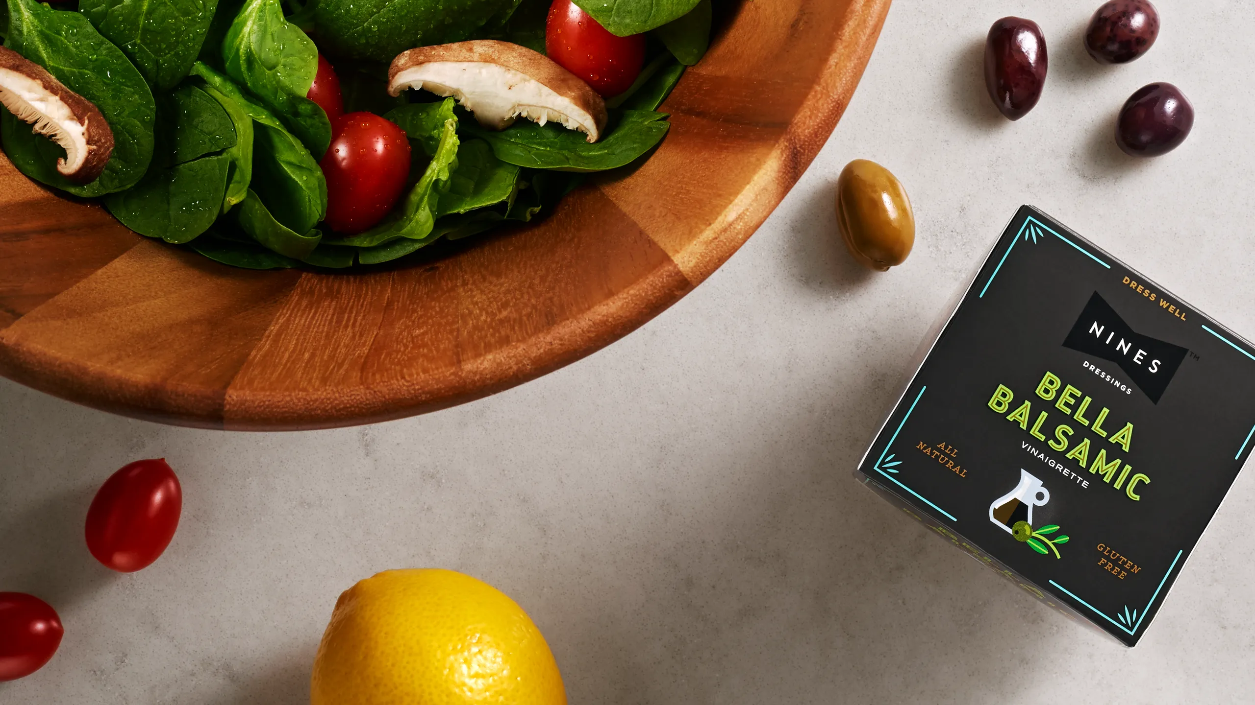
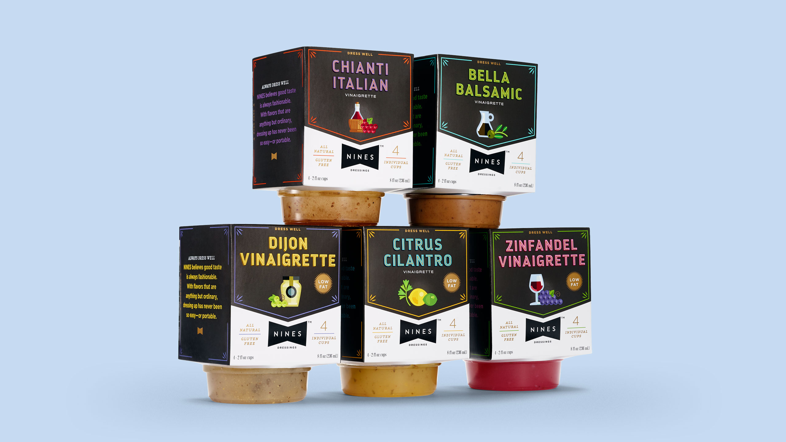
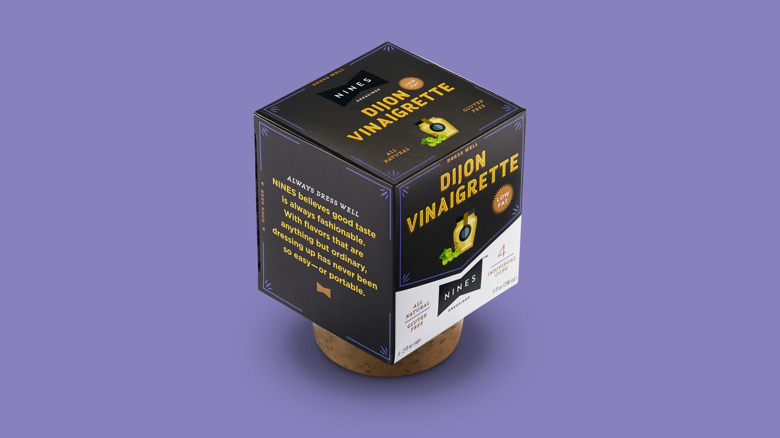
Put a bow on it. Nines Dressings was built on the idea that superb dressings can be portable.
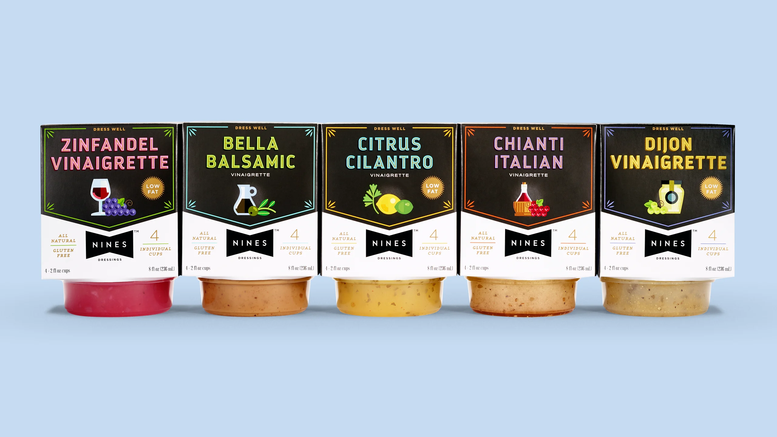
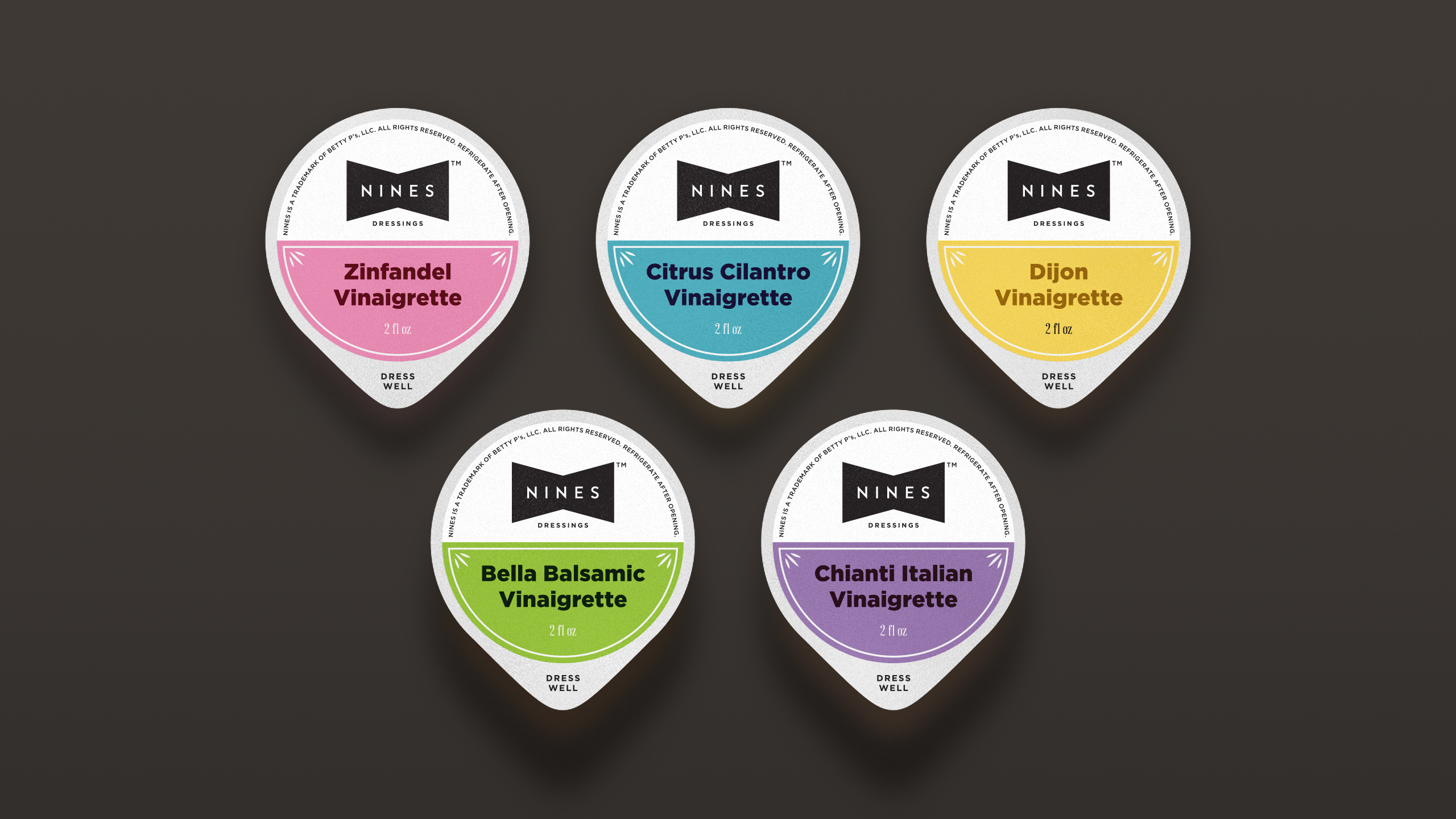
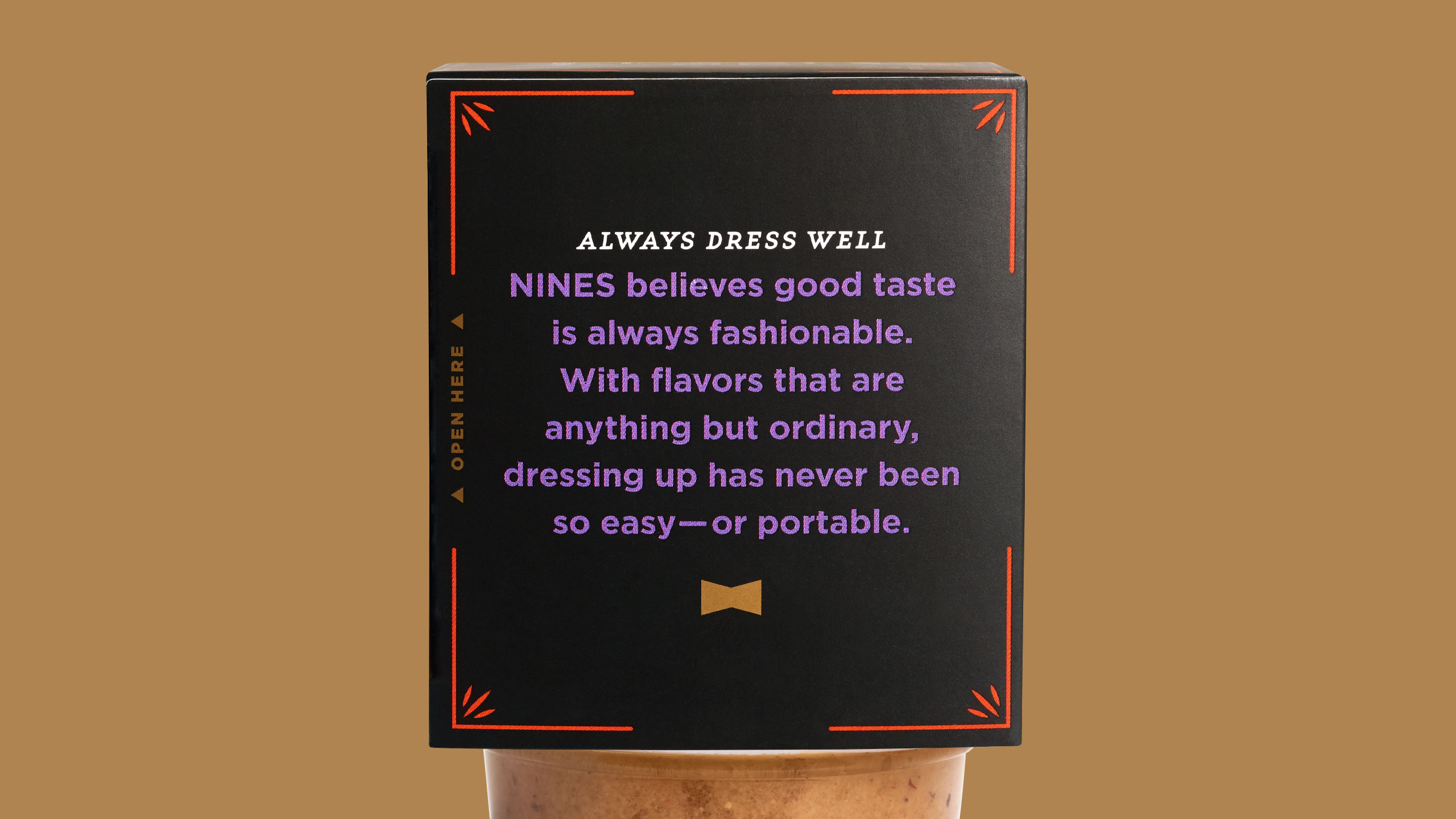
The brand needed that same strength of simplicity in its name, identity and packaging. A classic symbol of refinement provides subtle context for the inspiration behind the company and their family of premium products.
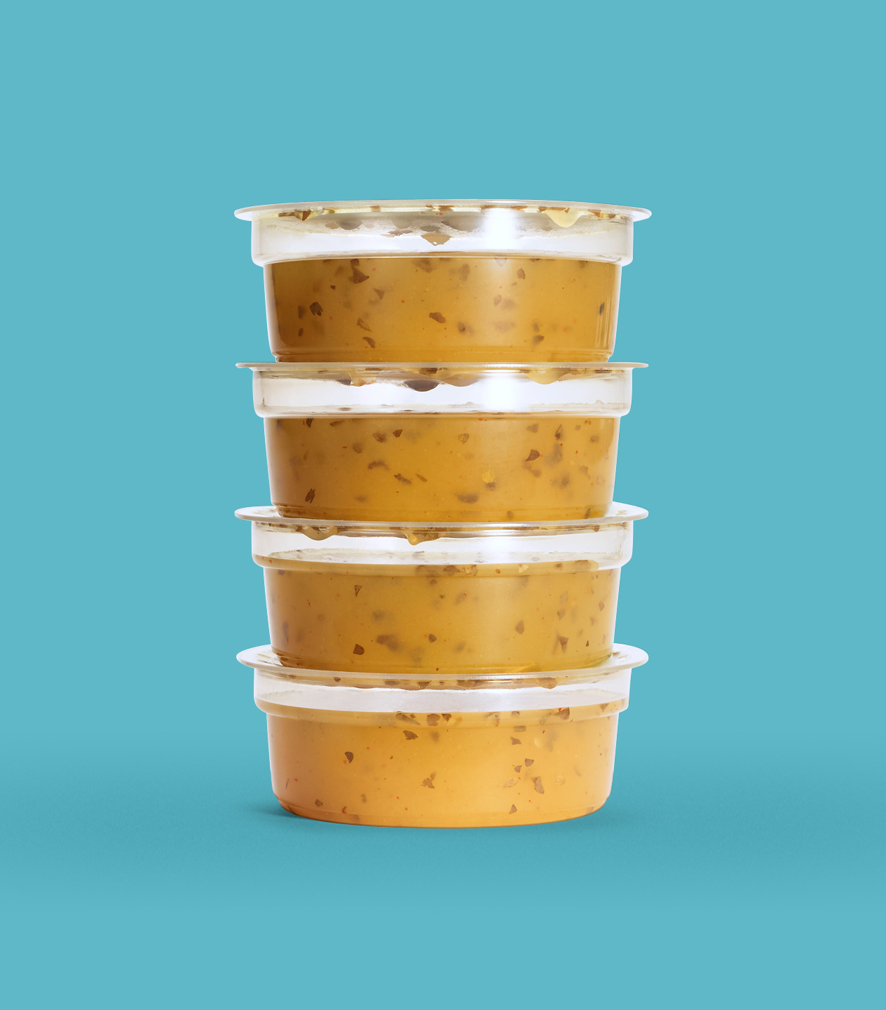
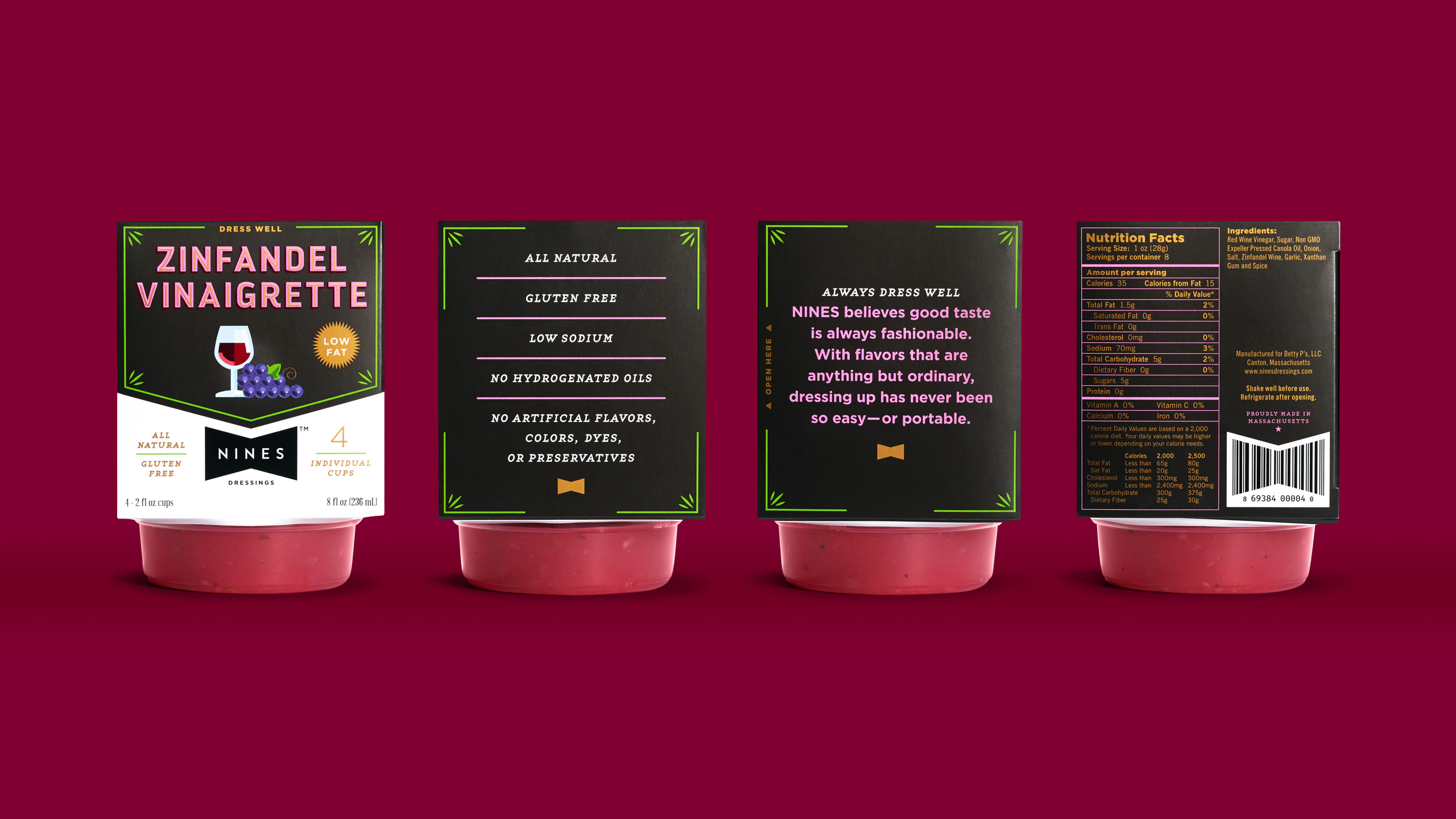
Working closely with founder Jeff Pearlstein, I helped construct the Nines Dressings brand from scratch. To convey a premium product that would have to compete with big brand names in the market, I approached the project knowing it would have to look and feel distinctly unique. Starting with an amazing line of flavor profiles, each using all-natural ingredients with the convenience of shelf stability, was the easy part. In order to differentiate from other portable or “grab-n-go” choices on store shelves, a compact, custom package would easily set Nines Dressings apart from its neighbors.
Client: Saratoga Dressings
Agency: Stebbings Partners
Photography: Jackie Young
Services:
Packaging
Branding






All Work
All Work
Nelson Couto
nelsonpcouto@gmail.com
Massachusetts, USA
© Nelson Couto unless otherwise noted


