Buzz in Rhode Island. Branding the Ocean State’s new energy provider.
Rhode Island Energy is Rhode Island’s new essential energy provider, serving nearly 800,000 customers while adding to a long and storied history in the state’s energy sector. RIE takes the reins with the goal of meeting Rhode Island’s green energy initiatives—including achieving long-term greenhouse gas reduction detailed in the Resilient Rhode Island Act.
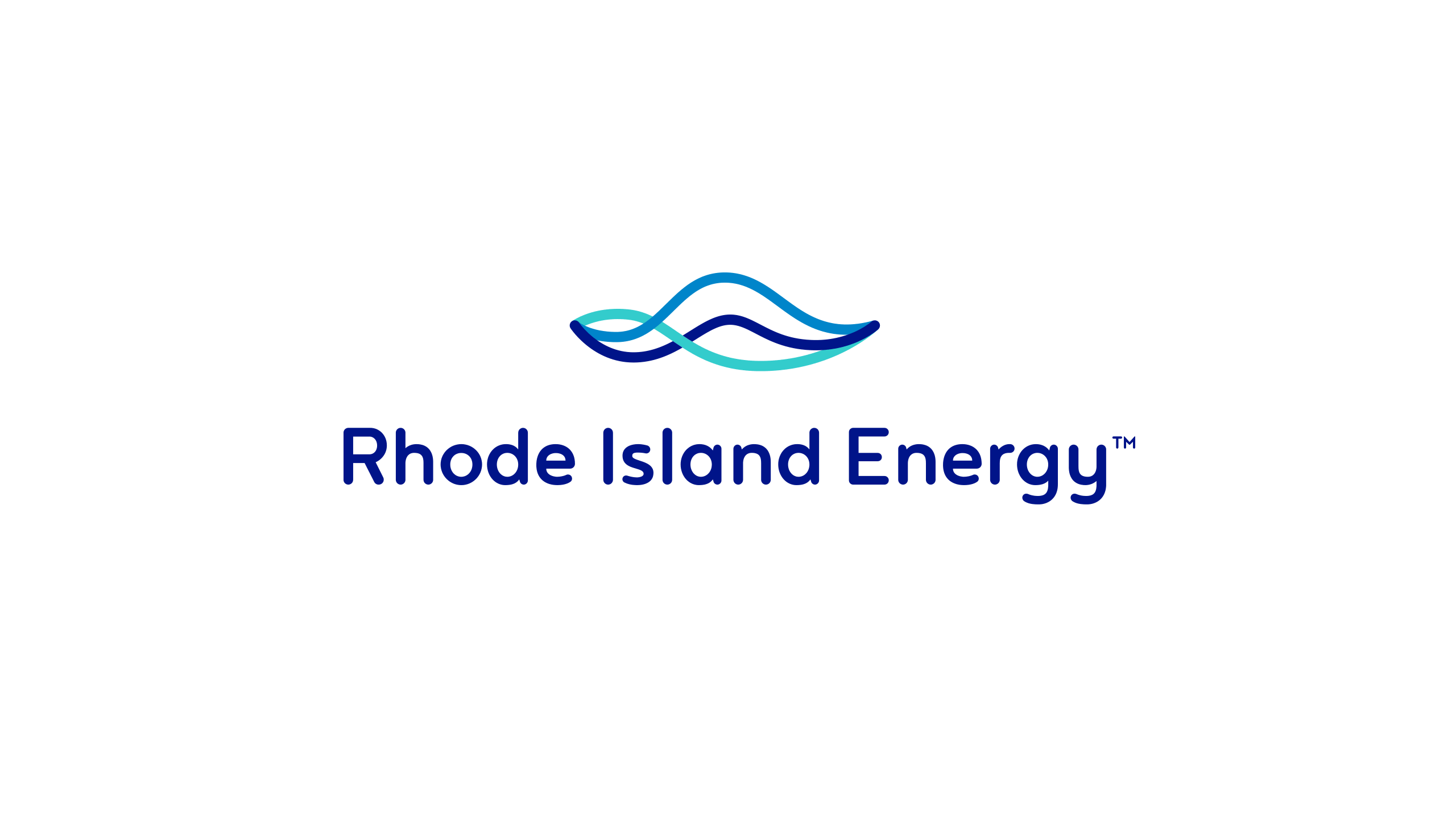
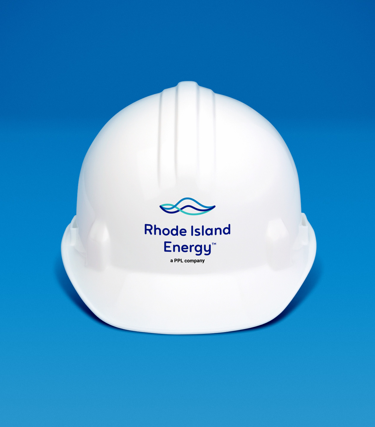
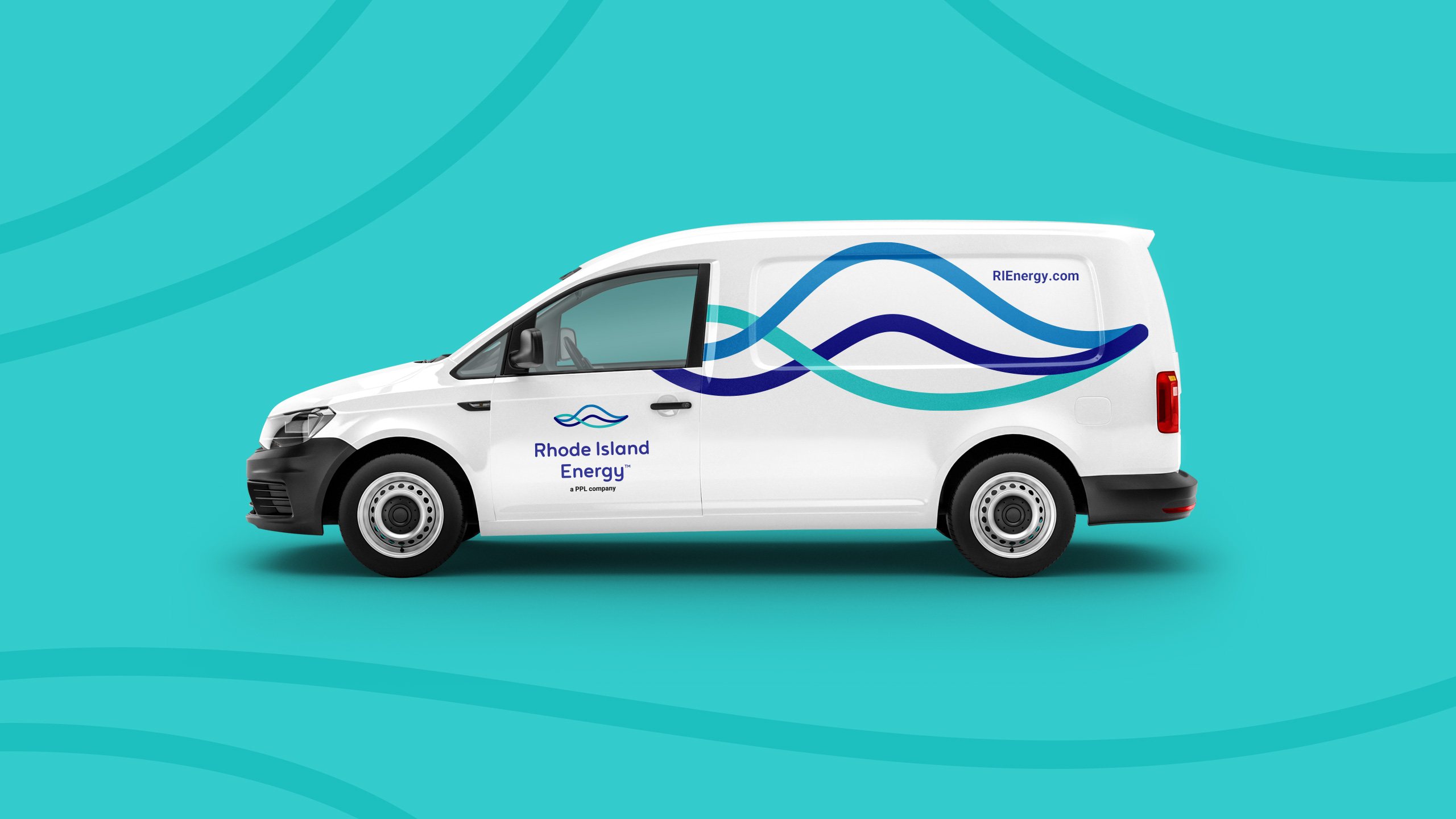
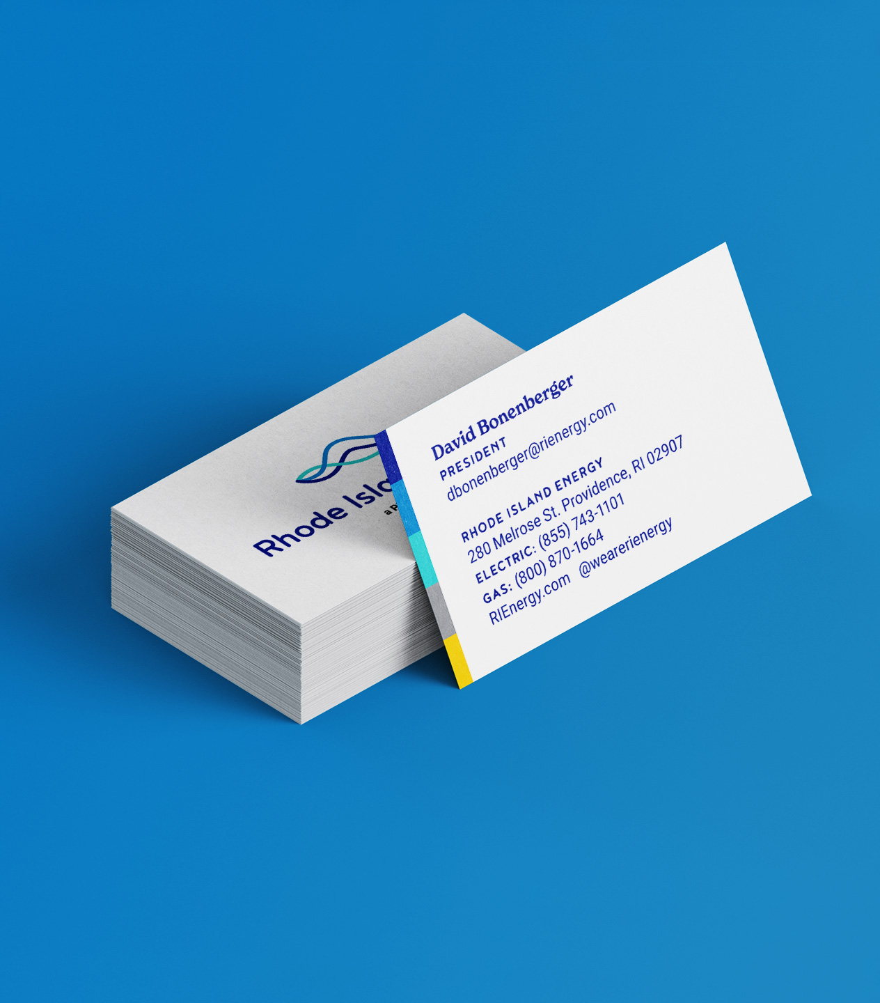
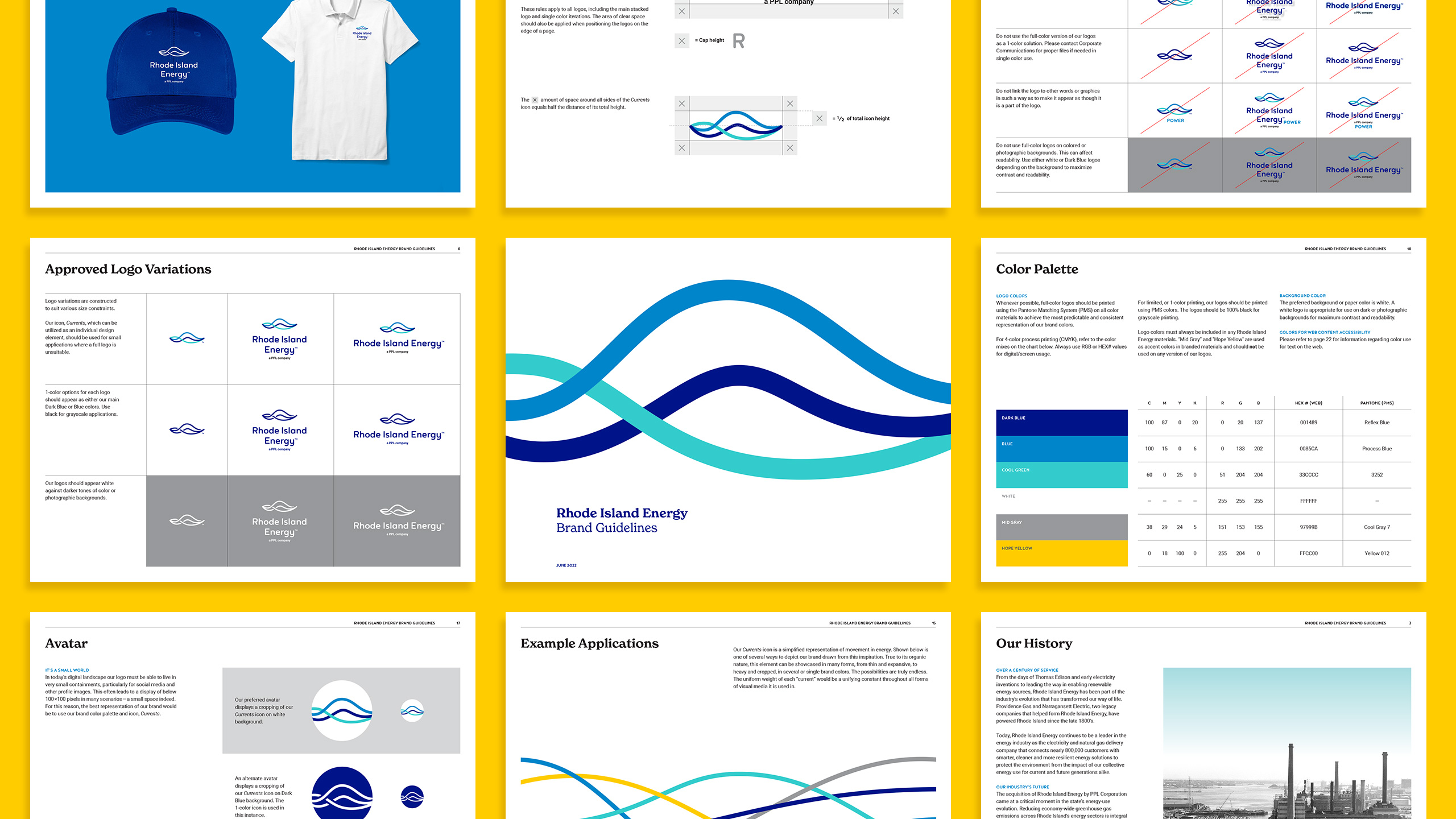
Their identity was influenced by the drive for a greener future (and the smart tech used to achieve it) with a fluid mark that symbolizes the currents found within the waters of Rhode Island, the utility lines that power its homes, the flow of natural gas, and the integration of renewable energy like solar and wind. Modern in form and balance, the currents harmoniously weave through one another appearing to always be in motion. The icon speaks to a steady and constant flow of energy while its one-color counterpart conveys movement through negative space.
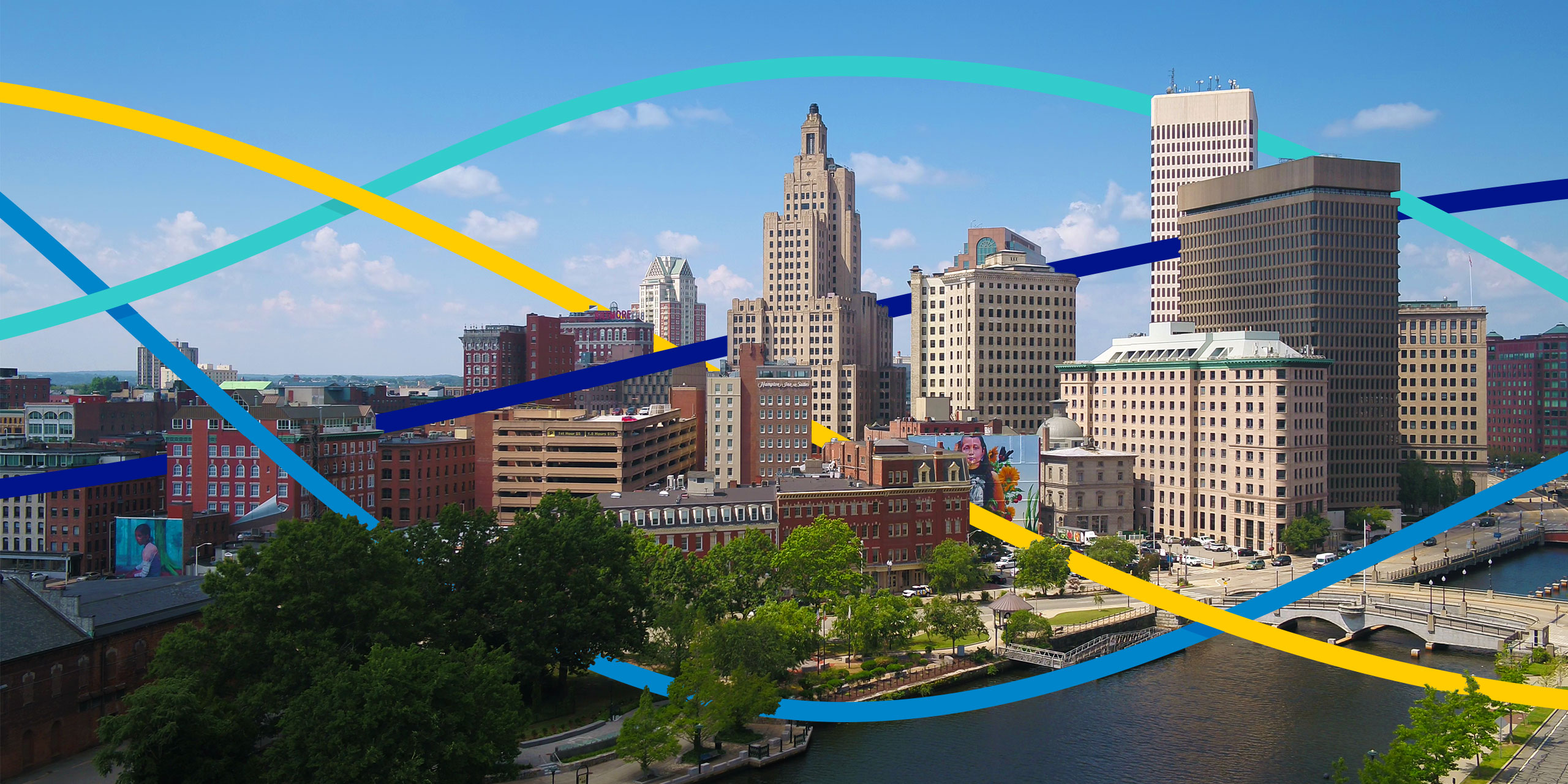
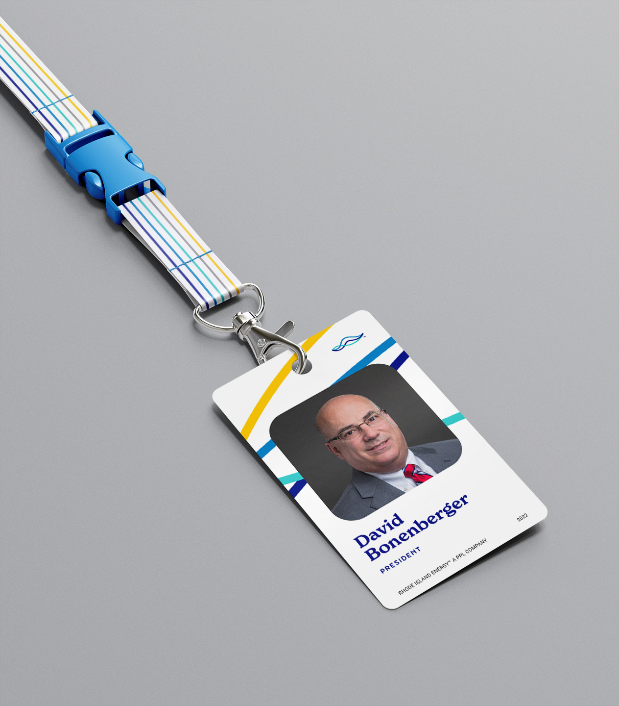
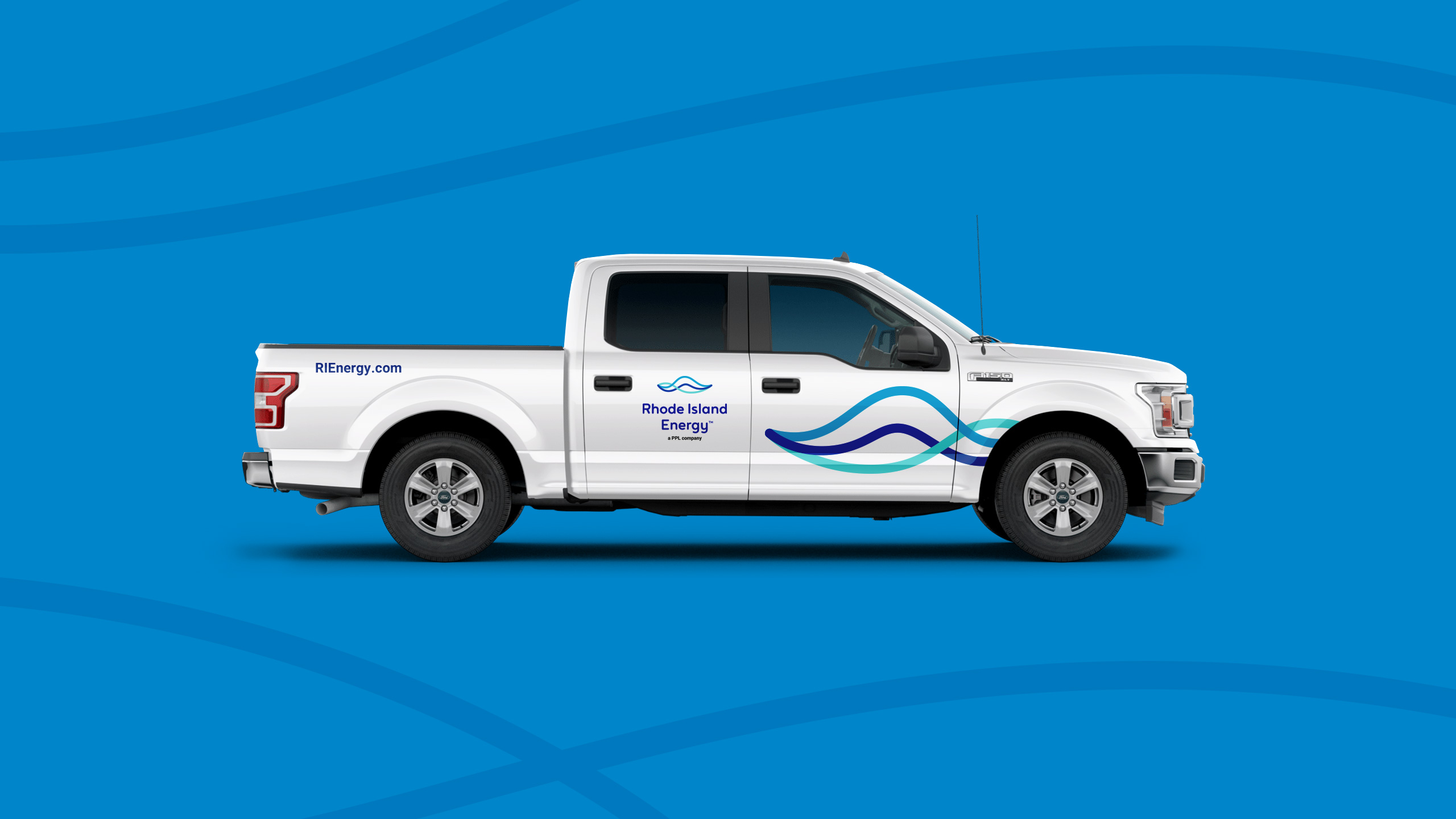
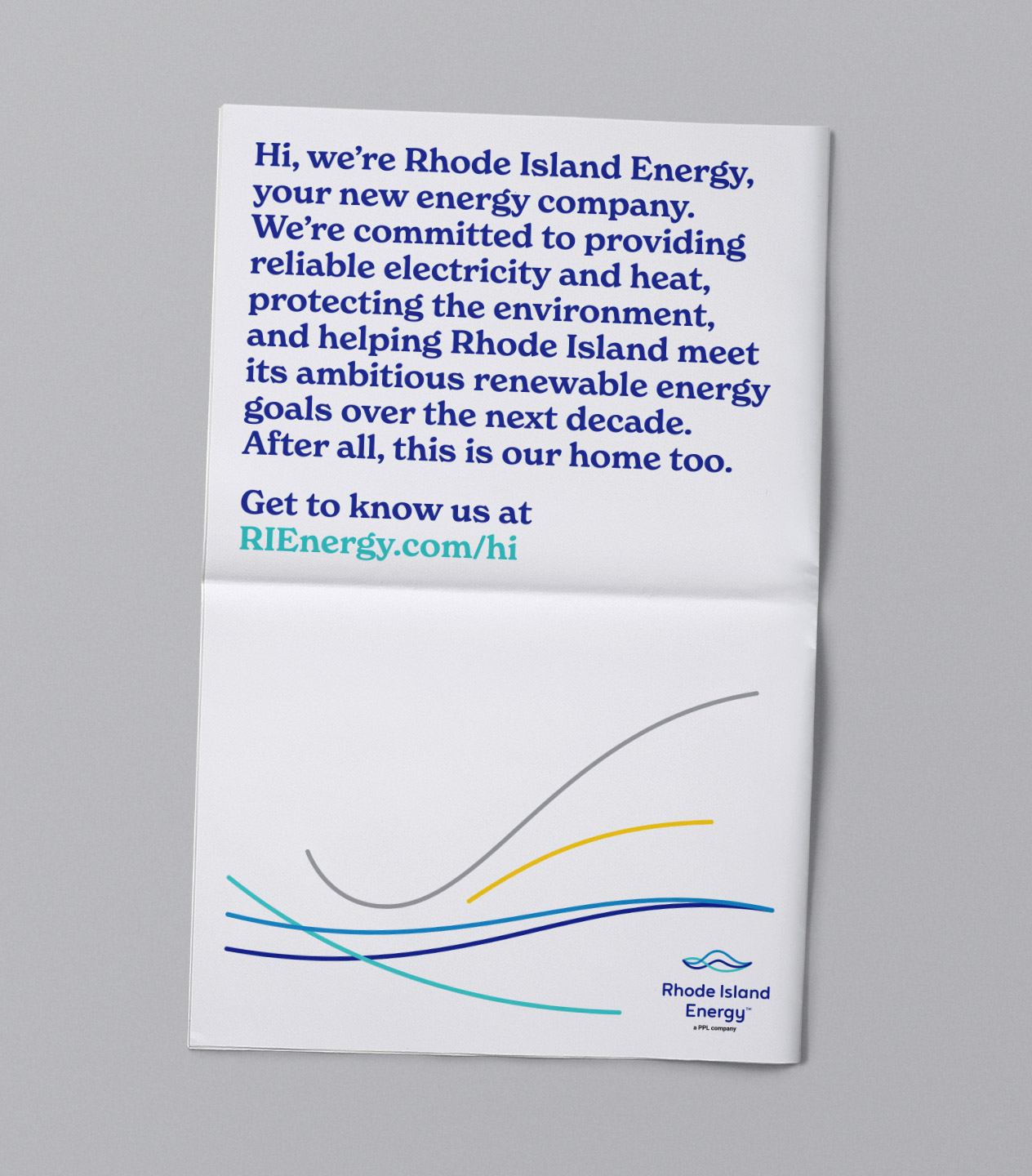
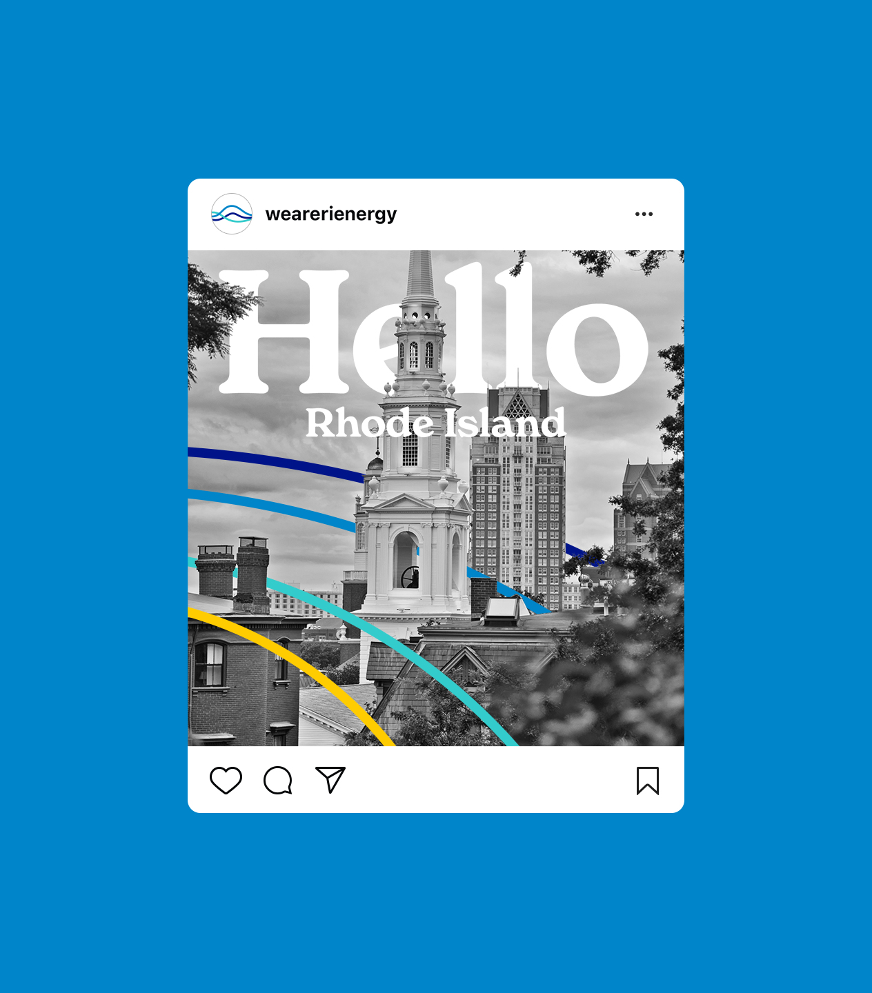
The currents play a larger role in branding and marketing efforts through lively, energetic patterns. Prior to launch, we provided RIE’s in-house creative team with assets and guidance to create dynamic touchpoints conveying a brand on the move!
Client: PPL Corporation
Agency: Luminous Creative
Services:
Strategy
Logo
Brand Guidelines
Digital Branding
Advertising






All Work
All Work
Nelson Couto
nelsonpcouto@gmail.com
Massachusetts, USA
© Nelson Couto unless otherwise noted

